The Psychology of Color: How to Choose the Perfect Palette for Your Home
Choosing the right color palette for your home is more than just picking out shades that look pretty together. It’s about creating a space that reflects your personality, enhances your mood, and sets the ambiance for your daily life. Psychology of Color, interior design, and home decor all intersect in this fascinating journey of selecting the perfect hues for your living space
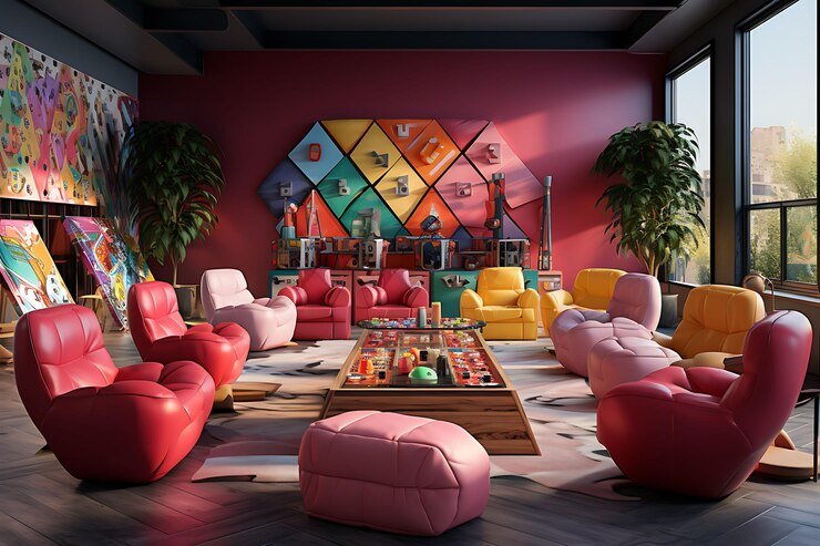
Color theory forms the backbone of this decision-making process, deeply rooted in the Psychology of Color. Understanding the emotional impact of color is important. For instance, warm tones like reds, oranges, and yellows are known to evoke warm feelings, energy, and excitement, making them ideal for places where you want to have conversation and activity, like the dining or living room. On the other hand, cooler shades such as blues and greens are quiet and calming, making them perfect for bedrooms or relaxation areas.
Color Relationships
Color relationships play a vital role in adding visual interest and personality to a room. Here are some key concepts and relationships to consider:
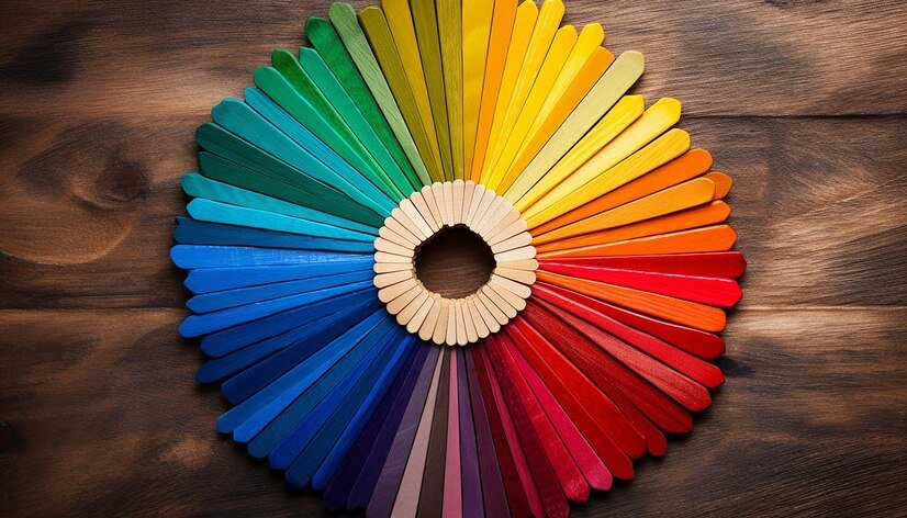
1. Wheel color: The color wheel is useful for determining complementary color schemes.. It has primary colors like red, blue, and yellow; secondary colors like orange, green, and purple; and tertiary colors, which are a mix of primary and secondary colors. Colors across from each other on the wheel are complementary, and colors next to each other are analogous. Mixing different colors together in a design can help create a sense of balance in a room.
2. Complementary Colors: Complementary colors are like best friends on the color wheel, deeply influenced by the Psychology of Color! They are opposite each other and make a super cool team. For example, red and green, blue and orange, and yellow and purple are complementary colors. When these colors come together, they create a powerful contrast and make each other even more amazing and vibrant. But remember, too much contrast can be too much for our eyes to handle. So, finding the right balance when using complementary colors is important.
3. Similar Colors: Similar colors are beside each other on the color wheel, like red, red-orange, and orange. When you use them together, they make a nice and smooth look, perfect for making a room feel connected. These color schemes are common in nature and can make you feel calm and peaceful.
4. Monochromatic colors: monochromatic colors are all about using different shades of one color. It’s like having different shades of blue, for example. This makes things look simple and classy, and it’s really easy to make everything match. By adding different textures and contrasts with shades, tints, and tones of the same color, you can keep things interesting and avoid getting bored.
5. Triadic Colors: Triadic color schemes are all about using three colors that are evenly spread out on the color wheel, influenced by the Psychology of Color. For example, you can choose red, yellow, and blue. This combination creates a well-balanced and lively palette while also making sure there is enough contrast. Triadic schemes can look really cool, but you have to be careful not to make the space too overwhelming.
6. Split-complementary colors: Split-complementary colors are like complementary colors, but they use one main color and two colors next to its opposite (for example, red, yellow-green, and blue-green). This gives a nice contrast, like complementary colors, but still keeps things looking balanced and harmonious.
7. Warm & Cool Colors: Warm colors like red, orange, and yellow make you feel energetic and warm. They also make you feel cozy and comfortable. Cool colors like green, purple, and blue have a calming effect. They can make a room feel more peaceful and make it seem bigger.
8. Neutrals: Neutrals are like the background of a painting. Colors like white, beige, gray, and taupe help to balance and stabilize the other colors in a design. They are super flexible and can go well with almost any color, creating a nice contrast and stopping things from getting too crazy.
Harmonious Color Schemes: Balancing Variety and Cohesion
When designing with color, it’s essential to consider the function of the space, the desired mood, and the preferences of the occupants. Experimenting with different color relationships can transform a space and create a personalized and visually appealing environment.
Creating a harmonious color scheme involves understanding color balance and coordination. While you want variety, you also want cohesion. Think about the color temperature as well; warm and cool colors can be balanced to create a comfortable and inviting atmosphere.
Cultural Impact on Color Perception: Understanding the Psychology of Color
Moreover, cultural influences play a significant role in color perception, intersecting with the Psychology of Color. Different cultures may view things that are seen as lucky or soothing in one society as causing various feelings in another. It’s important to consider these cultural differences when creating the atmosphere of your home, especially if you have a mix of backgrounds in your household or if you’re taking ideas from different cultural styles..
Staying updated on color trends can be helpful, but don’t feel like you have to follow them completely. Take them as ideas and make them your own to match your unique style and likes. Remember, making your home reflect your personality is the most important thing.
The psychological impact of color
Understanding the psychological impact of color goes beyond just the initial emotional response. It’s also about how colors are seen and connected to specific experiences or memories. By utilizing these connections, you can design a space that feels familiar and comforting.
In the end, selecting the ideal color scheme for your house is a profoundly individual journey intertwined with the Psychology of Color. It involves crafting a space that mirrors your true self, improves your overall happiness, and nurtures a feeling of ease and belonging. Therefore, don’t rush the process, try out various combinations, and have faith in your intuition. Remember, there’s no universal formula for designing a home that perfectly suits your needs
perfect